
Learn how to create a responsive and animating page header that moves up on page scroll using JavaScript
In modern web design we see many patterns emerge such as parallax scrolling, the one page long scroll or the hamburger menu icon. But one of the patterns we often see is the animated header that animates up when the user scrolls down the page. This pattern is seen a lot on mobile devices as it helps create more of the screen for the user and is much less obtrusive.As UX design cwontinues to be at the forefront of our thinking, these kinds of patterns can only be good for us going forward. So with this in mind, we are going to create a simple tutorial that demonstrates the animated header pattern when the page is scrolled down. We will be using CSS for the styling only, but we will be putting our JavaScript hat on to create a simple but very useful script that powers the animation.
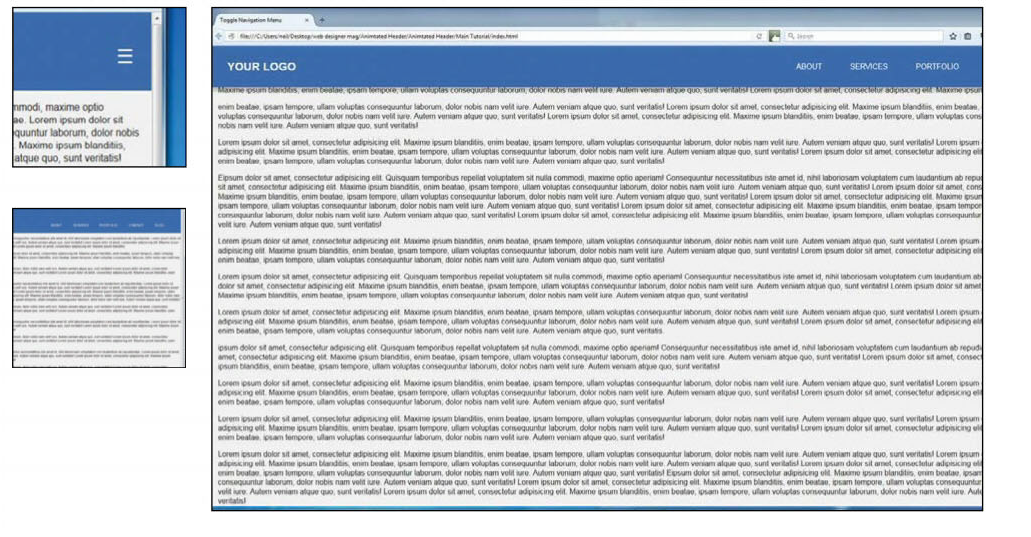
We will then make the whole page responsive so we can, if needed, see how this looks on a mobile device and test it accordingly. However, it must be said that this effect does perform much better on a desktop browser. So open up your favourite text editor and let’s get started!
1.Add the logo
Create a new HTML5 document and within the body tag, add an open and closing header element. We are then going to put our navigation in here using the HTML5 <nav> element. And within a <h1> tag, put in the text based logo, with a class name of ‘logo’.2.Create the navigation
The navigation menu will be positioned at the top left-hand side of the header, so we need to create an unordered list with four list items within it. Within these list items we will add four anchor tags with the navigation menu buttons in text.3.Responsive menu icon
We want the navigation to be responsive and that means we need to add in the hamburger icon that is associated with responsive menus. In fact, more and more designers are only using the hamburger icon and making the user click it to view other hidden buttons. But that’s beyond the scope of this tutorial. With the menu, place the hamburger icon just underneath the unordered list.
</ul>
<button class="toggle-menu" arialabel="Responsive
Navigation Menu"> </
button>
</nav><!-- end main navigation -->
</header>
4.Add the content
For the header to take effect we will need to add some content to the page. Start by adding the opening and closing <main> and then within the main tag add some paragraphs. It’s up to you how many paragraphs you add; we’ve added 11 but only shown four in the code example. If you have your own text, then great, if not then just add some Lorem Ipsum and even a few images for now.5.Scripts
This project won’t be able to function without our JS script. As you probably know, it’s good practice to always add the link to your scripts at the very bottom of the document, just above the closing body tag. And to keep things easy we will call our script, ‘scripts.js’.
<!-- My Scripts -->
<script type="text/javascript" src="scripts.
js"></script>
</body>
</html>
6.Normalize CSS
When starting a new design project, it’s always a good idea to take advantage of Normalize.css, which is a modern alternative to CSS resets. So head over to necolas.github.io/normalize.css/ and download the latest version of the software, and then add that to the head of the document, together with the link to the custom CSS file.
<!-- CSS files -->
<link rel="stylesheet" type="text/css"
href="normalize.css">
<link rel="stylesheet" type="text/css"
href="style.css">
7.Create a new CSS
Create a new CSS file and open it within your favourite text editor. We don’t need to include a long CSS reset when using normalize, but we will add a small one just to set some default styles to some elements and the body.
body,
h1,
ul {
margin: 0;}
li {
list-style-type: none;}
h1 {
font-size: 1.5rem;}
a {
text-decoration: none;
text-transform: uppercase;
color: #fff;}
/* BODY STYLES */
body {
background: #f1f1f1;
color: #272626;
font: 1em "Noto Sans", sans-serif;}
8.Set the header styles
Set the position of the header to ‘fixed’ and set the width to 100% of the browser window. Then we can apply a natural box layout model by using the ‘box-sizing: border-box’ property. Last of all, specify the colour to a light blue.The :not() pseudo class
The :not(X) property in CSS is a negation pseudo
class and accepts a simple selector1 as an
argument. Essentially, just another selector of any kind.
Left
With the unordered list now styled and positioned correctly, the navigation menu is taking shape
Top left
With the header now styled, start adding some more styling to the navigation menu
Top right
Some default styles have now been added, such as the background colour, list items and hamburger icon

9.The navigation
The newest layout mode in CSS3 is flexbox, which ensures that elements behave predictably when the page layout resizes to accommodate different screen sizes and devices. To make the navigation responsive, we’re going to use flexbox in order to specify a few things, which will be discussed in more depth in the ‘In Detail’ section of this tutorial.
nav {
display: flex;
align-items: flex-end;
justify-content: space-between;
transition: align-items .3s;
}
10.Style the logo
The logo is going to be text based, however feel free to add your own logo image here. Add the ‘transition’ property to the logo whose property values will slightly change in the future. By doing this, we can achieve a smooth transition effect between the initial state and the final state.
nav {
display: flex;
align-items: flex-end;
justify-content: space-between;
transition: align-items .3s;
}
Ensure you add browser prefixes
Remember to add browser prefixes to all of the CSS properties that need them, such as the ‘transition’ property. These will provide support for the new CSS features.
Top left
Hide the hamburger icon so that it can be revealed later on when the page becomes responsive
Top right
When we drag the browser window across to change the size of the page, the hamburger icon reveals itself
Right
As the user scrolls down the header animates up and a

Learn about flexbox

The flexbox layout is a new layout module in CSS3 that ensures elements behave predictably when the page layout must accommodate different screen sizes and display devices. To use flexbox layout just set the ‘display’ property on the parent HTML element:
All direct children of this element become flex items. Flexbox lets you build a ‘parent flex container’ and add sub containers inside called ‘flex items’. These dynamically adjust size by equally or proportionally distributing unused space, ensuring that the spacing of your design elements remain intact no matter what device is used to view the application..container { display: -webkit-flex; /* Safari etc*/ display: flex; }
11.Unordered list
The next step is to display the menu items across the header. Again, use flexbox for the display mode on the ‘ul’ tag and use some margins and padding to space things out in the way you want them to look. There should be 20px of right margin on all the <li> items, apart from the last </li> <li> item, which should not have any margin.
ul {
display: flex;
margin: 50px 50px 0 0;
padding: 0;
transition: margin .2s;
}
li:not(:last-child) {
margin-right: 20px;
}
li a {
display: block;
padding: 10px 20px;
}
12. Hide the toggle menu
The toggle menu is, of course, the hamburger icon that will display when the page is resized. The icon has its own default styling and some changes need to be made so it looks simplified. We will then hide it using ‘display: none’, but will, of course, reveal it using media queries later on.13. Style the scroll class
Towards the end of this tutorial, we are going to write a short script that animates the header. In this script we will dynamically add a class to our header called ‘scroll’. So we need to add some styles to the scroll class, such as change the font size, add a drop shadow and more.
main {
display: block;
padding: 0 20px;
}
.scroller {
box-shadow: 0 8px 5px 0
rgba(0, 0, 0, .2);
}
.scroller .logo {
padding: 10px 20px;
font-size: 1.5rem;
}
.scroller nav {
align-items: center;
}
.scroller .logo,
.scroller ul,
.scroller .toggle-menu {
 margin: 0;
}
14. Make it responsive
The last piece of CSS will be the media queries. There’s nothing too complicated here, so things should look pretty straightforward. However, the only thing to mention is the toggle menu. At the moment it is specified to be hidden (display: none), but we want it to show up when the page is resized, so the display mode needs to be set to ‘display: block’.
@media screen and (max-width: 1060px) {
header {
padding: 10px;
}
nav {
align-items: center;
 }
 ul {
 display: none;
 }
 .logo {
 max-width: 130px;
 max-height: 100px;
 margin: 5px 0 0 5px;
 }
 .toggle-menu {
 display: block;
 }
15. Write the script
Create a new JavaScript file and call it ‘scripts.js’. If you remember we already included the link to this within the HTML at the bottom of the page. Open it up and first of all create what is called a ‘self-executing anonymous function’. Declare this as strict mode so that undeclared variables can’t be used.
(function() {
‘use strict’;
})();
16. Declare the variables
On a new line underneath ‘use strict’ we can define some variables. By using ‘querySelector’ we can return the first element within the document with the class names specified within the parenthesis. In this case we want to target the classes ‘main’ and ‘header’ and store them in the variables.
var main = document.querySelector("main"),
header = document.querySelector("header"),
hHeight;
17. Calculate the header height
Now let’s create a new function and call it ‘setTopHeight’ and then within this function we can calculate the headers height. Add this value as ‘paddingTop’ to the ‘main’ element. This is achieved by using the ‘offsetHeight’ property.
function setTopHeight()
{
hHeight = header.offsetHeight;
main.style.paddingTop = hHeight + "px";
}
18. Create on scroll functions
Create a new function underneath the last function, called ‘onScroll’. And then within the ‘onScroll’ function create another empty function called ‘callbackFunc’. These functions will enable us to add a class to the header when the page has been scrolled down to a certain length.
function onScroll() {
function callbackFunc() {
}}
19. Add and remove scroller class
Within the ‘callbackFunc’ function we can use the ‘pageYOffset’ property to calculate the number of pixels that the document has been scrolled vertically. However, please note this property doesn’t work in older versions of IE (IE9 or under). Now use the ‘classList’ property to add and remove the scroller class from the header.
function onScroll() {
function callbackFunc() {
var y = window.pageYOffset;
if (y > 50) {
header.classList.add("scroller");
} else
{
header.classList.remove("scroller");
}}}
20. Add the event listener
All of the code created in the last few steps will not work until an event listener is added to the function. The event we are going to be listening for is the ‘scroll’ event. We then call the ‘callbackFunc’ function and the calculation should fire, so this event listener needs to go just above the call back function.
window.addEventListener("scroll",
callbackFunc);
21. Call on our functions
To make the animation work we can call on the functions in two different ways. When the page loads, both the ‘setTopHeight’ and ‘onScroll’ functions are called, but when the browser window is resized just the ‘setTopHeight’ function is called.
window.onload = function() {
setTopHeight();
onScroll();
};
window.onresize = function() {
setTopHeight();
};
22. Recommendations
This type of effect is being applied by a lot of designers these days, adding a subtle touch to the user experience. Try this out with more content within the header and see how things look once the browser is resized.Source Tutorial & Download Files: www.filesilo.co.uk/webdesigner